Hey friends welcome to Learn Angular Step by Step site, This is lab 10 article of an angular lab series, here we will understand Input, Output and emitters.
Download Source Code For This Lab
In lab 6 we have covered basic fundamentals of Angular like module, components, directives, expression and so on. To see this lab read from here.
In lab 7 we will look in to how to create Single page applications using Angular routing. To see Lab 7 you need to read from here.
In lab 8 we will understand how to implement validations using form, formgroup and formcontrol. You can see lab 8 by clicking on this link.
In lab 9 we will see how to make HTTP post and get calls to AP services using Angular. You can read the lab from here.
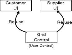
Reusability is one of the most important aspects of development. As Angular is a UI technology we would like to create UI controls and reuse them in different UI. For example in the Customer UI we have the table grid display. If we want to create grid in other UI we need to again repeat the "<tr><td>" loop. It would be great if we can create a generic reusable grid control which can be plugged in to any UI. |
|
If we want to create a GENERIC reusable grid control you need to think GENERICALLY, you need to think in terms of INPUTS and OUTPUTS. So the first visualization which you should have in your mind is that your GRID control is like a self-contained unit which gets a input of some data collection and when any one selects grid data the selected object is sent outside. So if you are using this grid control with a Customer UI you get a Customer collection, if you are using a Supplier UI you will get a supplier collection. |
|
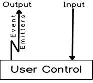
In order to achieve this generic thought process Angular has provided three things Input , Output and Event emitters. Input helps us define the input data to the user control. Output uses event emitters to send data to the UI in which the user control is located. |
|
First let us plan how our grid component will look like. Grid component will be called in main HTML using "<grid-ui></grid-ui>" HTML element. The grid component will have three attributes: -
<grid-ui  [grid-columns]="In this we will give column names"
    [grid-data]="In this we will give data for grid"
    (grid-selected)="The selected object will be sent in event">
</grid-ui>
So first let us go ahead and add a separate file for grid component code and name it "GridComponent.ts". In this file, we will write all code that we need for Grid component. |
|
The first step is to add necessary components which will bring in Input and Output capabilities. For that we need to import component , Input , Output and event emitter component from "angular/core".
import {Component,
        Input,
        Output,
        EventEmitter} from "@angular/core"
As this is a component we need to decorate the class with "@Component" decorator. The UI for this component will coded in "Grid.html". You can also see in the below code we defined the selector has "grid-ui" , can you guess why ?.
If you remember in the planning phase we had said that the grid can be called by using "<grid-ui>" tag.
@Component({
    selector: "grid-ui",
    templateUrl : "../UI/Grid.html"
})
export class GridComponent {
}
As this is a grid component we need data for the grid and column names for the grid. So we have created two array collection one, "gridColumns" (which will have column names) and "gridData" ( to data for the table).
export class GridComponent {
    // This will have columns
    gridColumns: Array<Object> = new Array<Object>();
    // This will have data
    gridData: Array<Object> = new Array<Object>();
}
There are two methods "setGridColumns" and "setGridDataSet" which will help us to set column names and table data to the above defined two variables.
These methods will be decorated by using "@Input" decorators and in this we will put the names by which these inputs will be invoked while invoking this component.
// The top decorator and import code is removed
// for clarity purpose

export class GridComponent {
// code removed for clarity
    @Input("grid-columns")
    set setgridColumns(_gridColumns: Array<Object>) {
            this.gridColumns = _gridColumns;
        }
    @Input("grid-data")
    set setgridDataSet(_gridData: Array<Object>) {
            this.gridData = _gridData;
        }
}
The names defined in the input decorator will be used as shown below while making call to the component in the main UI.
<grid-ui  [grid-columns]="In this we will give column names"
    [grid-data]="In this we will give data for grid" >
</grid-ui>
As discussed in this Labs theory section we will have inputs and outputs. Outputs are again defined by using "@Output" decorator and data is sent via event emitter object.
To define output we need to use "@Output" decorator as shown in the below code. This decorator is defined over "EventEmitter" object type. You can see that the type is "Object" and not "Customer" or "Supplier" because we want it to be of a generic type. So that we can attach this output with any component type.
@Output("grid-selected")
    selected: EventEmitter<Object> = new EventEmitter<Object>();
Now when any end user selects a object from the grid we need to raise event by using the "EventEmitter" object by calling the "emit" method as shown below.
// Other codes have been removed for clarity purpose.
export class GridComponent {
    @Output("grid-selected")
    selected: EventEmitter<Object> = new EventEmitter<Object>();

    Select(_selected: Object) {
        this.selected.emit(_selected);
    }
}
Below goes the full code of "GridComponent.ts" which we have discussed till now.
import {Component,
        Input,
        Output,
        EventEmitter} from "@angular/core"

@Component({
    selector: "grid-ui",
    templateUrl : "../UI/Grid.html"
})
export class GridComponent {
    gridColumns: Array<Object> = new Array<Object>();
    // inputs
    gridData: Array<Object> = new Array<Object>();

    @Output("grid-selected")
    selected: EventEmitter<Object> = new EventEmitter<Object>();
    @Input("grid-columns")
    set setgridColumns(_gridColumns: Array<Object>) {
            this.gridColumns = _gridColumns;
        }

    @Input("grid-data")
    set setgridDataSet(_gridData: Array<Object>) {
            this.gridData = _gridData;
        }

    Select(_selected: Object) {
        this.selected.emit(_selected);
    }
}
Also we need to create UI for the "GridComponent.ts". Remember if we have an Angular component we NEED A HTML UI for it. So in the UI folder we will add "Grid.html" in which we will write the code of table display. |
|
In the "GridComponent.ts" ( refer Step 4 of this Lab) we have defined input "gridColumns" variable in which we will provide the columns for the grid. So for that we had made a loop using "*ngFor" which will create the columns "
<table>
 <tr>
        <td *ngFor="let col of gridColumns">
            {{col.colName}}
        </td>
    </tr>
</table>
And to display data in the grid we need to loop through "gridData" variable.
<tr *ngFor="let colObj of gridData">
        <td *ngFor="let col of gridColumns">
            {{colObj[col.colName]}}
        </td>
        <td><a [routerLink]="['Customer/Add']"
(click)="Select(colObj)">Select</a></td>
    </tr>
So the complete code of "Grid.html" looks as shown below.
<table>
    <tr>
        <td *ngFor="let col of gridColumns">
            {{col.colName}}
        </td>
    </tr>
    <tr *ngFor="let colObj of gridData">
        <td *ngFor="let col of gridColumns">
            {{colObj[col.colName]}}
        </td>
        <td><a [routerLink]="['Customer/Add']"
(click)="Select(colObj)">Select</a></td>
    </tr>
</table>
So now that our reusable component and its UI is completed l, lets call the component in the "Customer.html" UI.
Below is the full proper code which has column names defined in "grid-columns" and in "grid-data" we have set "Customers" collection. This "Customers" collection object is exposed from the "CustomerComponent" class. This "Customers" collection is that collection which we had created during the "HTTP" call lab. This variable has collection of "Customer" data.
<grid-ui
      [grid-columns]="[{'colName':'CustomerCode'},{'colName':'CustomerName'},{'colName':'CustomerAmount'}]"
    [grid-data]="Customers"
    (grid-selected)="Select($event)"></grid-ui>
Also we need to ensure that the old "<table>" code is deleted and is replaced with the above "<grid-ui>" input /output tag.
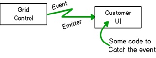
If you remember in our "GridComponent" we are emitting event by calling "emit" method. Below is the code snippet for it. Now this event which is emitted needs to caught in the "CustomerComponent" and processed. |
|
export class GridComponent {
    Select(_selected: Object) {
        this.selected.emit(_selected);
    }
}
So in order to catch that event in the main component we need to create a method in "CustomerComponent" file. So in the customer component typescript file we will create a "Select" function in which the selected customer will come from the GridComponent and that selected object will be set to "CurrentCustomer" object.
export class CustomerComponent {
Select(_selected:Customer) {
        this.CurrentCustomer.CustomerAmount =_selected.CustomerAmount;
        this.CurrentCustomer.CustomerCode = _selected.CustomerCode;
        this.CurrentCustomer.CustomerName = _selected.CustomerName;
    }
}
Also we need to ensure that the "GridComponent" is loaded in the main module. So in the main module import the "GridComponent" and include the same in the declaration of "NgModule" decorator as shown in the below code.
import { GridComponent }   from '../Component/GridComponent';
@NgModule({
    imports: [RouterModule.forRoot(ApplicationRoutes),
        InMemoryWebApiModule.forRoot(CustomerApiService),
             BrowserModule,ReactiveFormsModule,
             FormsModule,HttpModule],
    declarations: [CustomerComponent,
                MasterPageComponent,
                SupplierComponent,
                WelcomeComponent,
                GridComponent],
    bootstrap: [MasterPageComponent]
})
export class MainModuleLibrary { }
And that’s it hit Control + B, run the server and see your reusable grid working.
Download Source Code For This Lab